
When it comes to creating an effective, high-converting landing page, the advice all seems the same: Change your font. Switch the button color. Use strong language. This is all great advice, but truth is, the real issues impacting your conversions go much deeper than fonts and colors.
How do you convert a click — whether on an ad or a link — into a purchase? How do you reduce bounce rates? Below, we’ll dive into a few ways you can improve your landing pages and drive more product sales.
Build your landing page
First, you need to commit to actually creating a landing page in the first place. While product pages have their purpose, targeted paid campaigns are not it. According to the MarketingSherpa Landing Page Handbook, 44% of B2B ads direct a prospective customer to the company website and not a dedicated landing page. This is a waste of a good click.
So, what is a landing page?
A landing page is a web page specifically designed to be the destination for leads and prospective customers when they click on a link in an email, an ad, or somewhere else. An effective landing page makes it easy for leads to convert.
A lead who clicks on a link in an ad and lands on your home page or your product page has extra work to do. They have to search for the actual product or messaging that brought them there in the first place — and as any marketer with experience will tell you, they’re much more likely to bounce than convert. (At SevenAtoms, we’ve certainly found this to be the case!) A landing page, on the other hand, leads them to a desired course of action.
But it’s not enough to simply have a landing page. You need to optimize the landing page for the unique ad campaign you’re running to boost conversions. If you do it right, you can push your customers through the buying journey with a single web page.
Create specific landing pages for different channels
Now that you’ve decided to make a landing page, it’s time to create variants that appeal to specific target audiences. After all, someone who clicks through to your page from Google Ads might have different needs than someone who saw your ad on Facebook or Instagram. In fact, more landing pages typically means you’ll generate more leads.
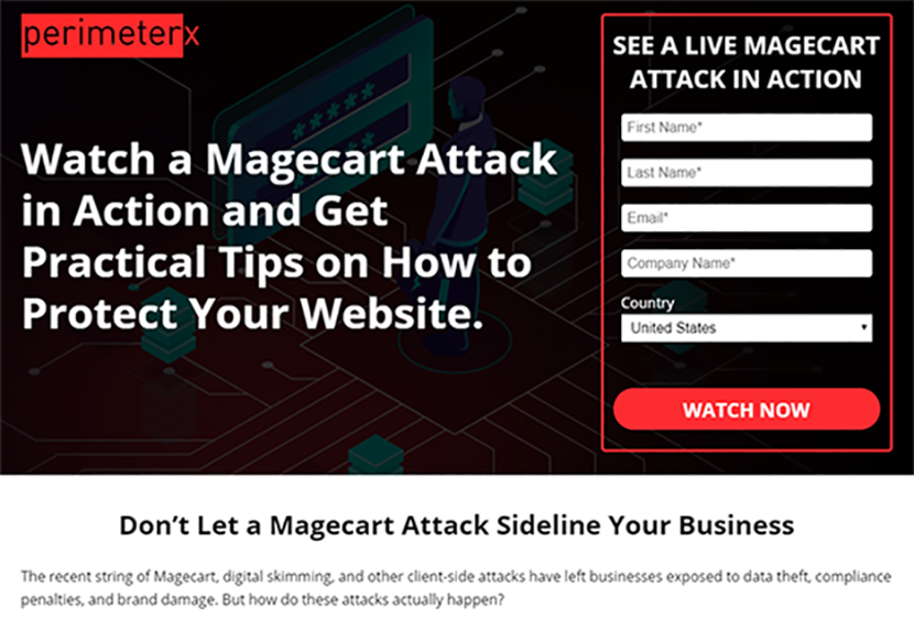
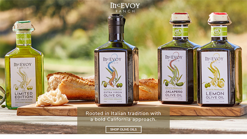
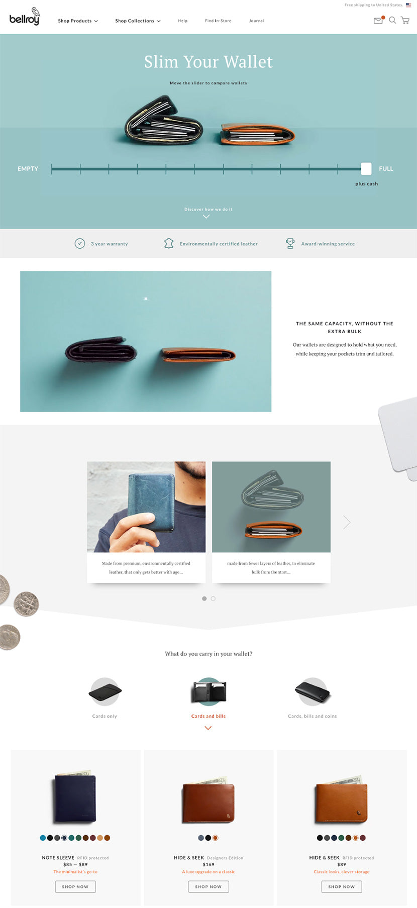
It’s important to consider both the traffic source and your audience’s intent — what brought them there in the first place. Someone who clicked on a LinkedIn ad is likely looking for no-nonsense information on how a product can help their business, while someone who clicked on an Instagram post will likely appreciate rich visual content and product photography. Instead of offering a generic experience to every visitor, create end user personas based on what you know about the market demographics behind each unique channel. Think about the demographics of people who shop with you. How old are they? Are they typically male or female? Do they live in urban neighborhoods or rural areas? Depending on your business, you may have different points of interest — an online retailer selling dresses might have a heavily female customer base, so a gendered split might not make much sense, but a split on age or lifestyle might. Use this information to create hypothetical individuals who possess key qualities. For example: Amy plays on an adult volleyball team and is also an active runner. She needs comfortable yet stylish wear. Hannah enjoys going to happy hour with colleagues and dinner parties with friends. She primarily needs cocktail dresses and fashionable accessories. Thinking of your users as people, rather than a data set, makes it easier to tailor marketing strategies to them. Reverse engineer your landing pages to meet your users’ needs. It’s also not a bad idea to have specific landing pages for leads at different points in the marketing funnel. This means treating customers differently depending on if they’ve never heard of your business or products before, if they know a little about you, or if they’re returning customers — and more likely to buy from you again. In fact, 40% of an online store’s revenue comes from just 8% of shoppers. One simple way that audiences differ is by gender. Consider the gender distribution of social media audiences: So if your ad is running on Pinterest, tailoring your landing page for a largely female audience could boost effectiveness. Think about how a prospective customer might see an ad that leads to your site. What did they search for that made your ad pop up? From there, what language compels them to click on it? Odds are, this prospect uses the same keywords, or search terms, you’re targeting. The prospect should be able to tell they’re in the right spot at a glance. When reality doesn’t meet expectations, people feel confused or, worse, frustrated with their experience engaging with your ad, landing page, and brand. You only have about 15 seconds to convince someone to stick around on any given page, so it’s important to start addressing their concerns right away. The copy visible “above the fold” (in other words, without having to scroll down) should include the keywords they searched for. Here’s an example of a landing page we created for PerimeterX, a SaaS cybersecurity company. They were launching a webinar educating ecommerce companies about data harvesting Magecart attacks. We targeted the following keywords: When searchers landed on this page, they immediately knew the webinar had the content they were looking for. This kept them on the page and encouraged them to register. Here’s where to put your keywords: Another note on images: Make sure they’re relevant and complementary to the written content, providing visual cues to users. If you’re targeting “inflatable family pool,” use images of a family playing in their inflatable pool. This is a landing page we created for McEvoy Ranch, a California-based retailer of gourmet food items like organic olive oils and jams. For a client like this, we knew it was important to really tantalize a viewer and make them hungry — quite literally. Excellent visual design and product photography are key to making sure a lead sticks around. It’s a good idea to adopt a simple design featuring effective imagery to show off the product. Strive to optimize your landing page design for consumer motivation. Consider color psychology and how it can affect your brand’s image. Sporty brands might want energetic, bright colors, while luxury brands might want more subdued, elegant-feeling ones. Also consider the product and what qualities customers consider when making their decision to buy. For instance, if you’re selling apparel, it’s a good idea to show images of people wearing the clothes you’re offering so consumers can see what it looks like in use. This landing page from Bellroy is the perfect example: the product photography is high-quality, showcases details of the wallets, and uses a simple layout. You can get creative with lifestyle images too. These types of product photos show context so customers can see how it will fit in their lives. Remember to think through the composition of the image so it’s clear what you’re trying to sell. And then think about how they’ll fit on the page — not just each image individually. If you’re selling a grill, for example, you want consumers to focus on that instead of the plate of burgers or the backyard. The grill should be the focal point of the image. So make sure your props and setting are convincing but not so busy that they’re distracting. Then pose your models so their sight lines and gestures draw the viewer’s attention where you want it. You can even play with focus and lighting to direct the consumer’s attention. For some products, 360-degree photography that lets viewers see a product from all angles can be helpful as well. With items like clothing or furniture, consumers will want to know how a product looks from behind or from the side so they can better envision how it will function for them. This step is less important for items where only one side is important: people don’t need to see the back of a picture frame, for example, so there’s no need to waste time or resources getting a photograph of it. Many landing pages offer video. On the surface, this makes sense; humans are genetically programmed to pay attention to motion. Furthermore, you can use video to demonstrate product features that don’t work as well in static shots. Imagine you were trying to sell a collapsable, portable table for exterior events. Which do you think would be more effective, showing shots of the table in its case and deployed, or a video showing how quick it is to set up and stow away? While video can be both entertaining and informative, it should never be the only source of information. You don’t want to alienate potential customers because they’re in an environment where they can’t watch the video.
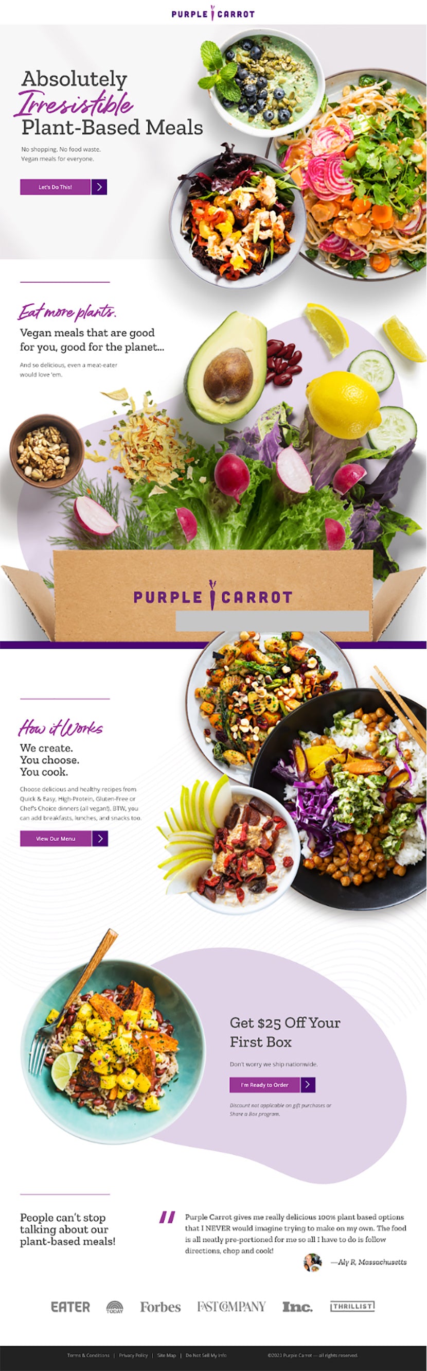
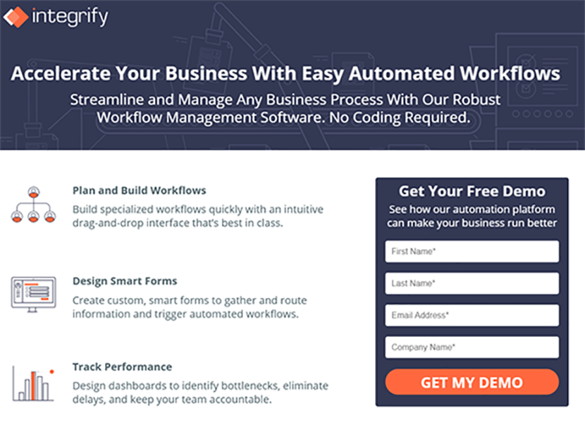
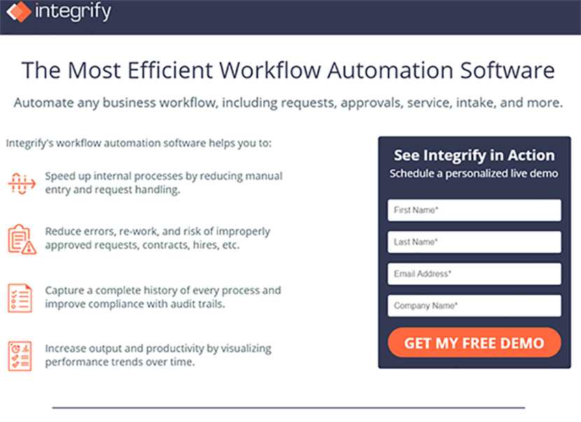
Ineffective landing pages often have too many elements competing for a user’s attention. This dilutes your message, overwhelms users, and leads to bounces. Take this landing page from Purple Carrot, for example. There are only three CTAs on the entire page. The CTAs are similar but different, and written in a way that’s both approachable and clear. Resist the urge to throw in too many calls-to-action (CTAs) and center your landing page around a single, focused CTA. Use just one button or link to direct visitors to your desired outcome. Every other button or link on the page detracts from what you want the user to do. One Marketing Experiments test found that including a single CTA improved conversions by 266%. Your conversions will increase if you shoot for a 1:1 between what you can actually do on the page and what you want people to do. It’s also important to make every CTA transparent. If your CTA says “Click here” or “Get started,” this provides limited and vague information about what’s next. Specific language like “Browse new products” or “Buy now” sets clearer expectations. Check out the landing page we created below for SealSkin Covers, which sells all weather vehicle covers. The copy is direct and matches the search terms someone might be looking for, like “Chevrolet Impala car cover” or “top rated car cover.” The “Shop now” CTA is immediate and unambiguous. While the full page offers more detail for shoppers who need more convincing, the CTA is always the same — and always clear. Consider the user’s point-of-view when crafting your CTA, and where they are in their purchasing decision. For example: Your CTA should also reiterate the benefits for the user. Take our hypothetical dress retailer from earlier. Rather than a CTA saying “browse our collection,” they might have more success with a CTA saying “Find your perfect dress.” Remember: Your customers are worried mainly about what’s in it for them. Use your landing page to tell them exactly how your product can meet their needs. We’re not infallible. You might not get it right the first time. It’s never a bad idea to try different variants of landing pages to figure out what works best. If you’re unfamiliar with the concept of A/B testing, it’s fairly simple: You create multiple variants of a landing page and see which drives the most conversions. But you need a strategic approach to A/B testing. Here’s a five-step process to follow: Below are two examples of landing pages we did for Integrify, a workflow management and automation SaaS solution. The goal of both is the same — collect a user’s information and get them to sign up for a demo, which demonstrate the software’s value — but we changed page layout, copy, highlights, and even the icons. Version A: Version B: Don’t just copy what the competition does. It’s important to understand your target prospects enough to create the right landing page that motivates them to act. This may all seem like a lot to consider, but by following the steps discussed in this article, you’ll be well on your way to boosting your landing page ROI. Remember to:
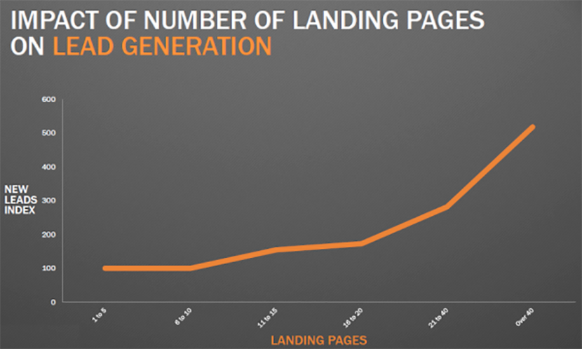
While most companies don't see an increase in leads when increasing their total number of landing pages from 1-5 to 6-10, companies do see a 55% increase in leads when increasing their number of landing pages from 10 to 15. And look how that leads index number spikes even more when a company has 40 or more landing pages on their website.
Athletic Amy, 29
Hostess Hannah, 45
Match landing page copy, ad copy, and keywords
Visually delight but don’t overwhelm
Make your calls-to-action clear and actionable

A/B test to learn what works and what doesn’t
Convert your way to ROI


")


